For those who haven't seen... (warning, lots of pics)
Moderator:Æron
- VenM2
- Posts:1767
- Joined:Fri Nov 10, 2006 11:20 pm
- Location:Savannah College of Art and Design. Not really, I just go there for school.
I was digging up in my various storage devices and found some stuff that I might have not shown yet, so I decided to put it up.
To start, some of you who visit DA might know about my flash animation I made a few weeks back: http://vengencemkii.deviantart.com/art/ ... n-75420372
Well think of the following as behind the scenes:
Animation Treatment Cover
http://img213.imageshack.us/img213/8081 ... vernc7.jpg
Before I could even start making the animation I needed a vision properly put onto paper. Harder than it sounds but I managed to have a clear vision for this particular project. Here is the first and ORIGINAL storyboard I made for my animation:
The final animation actually deviated only slightly from the original concept! Now, since the very beginning of the project I knew I was WAY in over my head. I only had a basic understanding of Flash and I wasn't exactly proficient at making hand drawn animations. In order to speed up productions I made the backgrounds from 3D renders and found images.
http://img174.imageshack.us/img174/9275/alley1auk9.jpg
Using rendered backgrounds helped speed up production a great deal. Before I started hand animating I wanted to get a good feeling of how the character would be moving so I made practice and reference sketches.
This is an original sketch of one of Greg's frames in the animation.
The last scene in the animation was undeniably difficult to settle on. As I was scouring my files for something I could use I found a 3D model of a mech I made and never finished long ago. I used this in the final scene:
http://img254.imageshack.us/img254/7398/namwcopyar7.png
When it all came together I got this:
http://img352.imageshack.us/img352/824/splashwipvz0.jpg
In other news I have brought Vertigo's orthographic pics I used as reference to make his head:
http://img301.imageshack.us/img301/4087 ... de2mi6.jpg
ALERT!!! ORIGINAL CONCEPT!!!:
This here is the first original concept for Greg's blue form. I quickly gave it up but hey, behind the scenes XD
http://img518.imageshack.us/img518/8418 ... e2pcn7.jpg
A back view of the final version.
This here is a concept render of my next project at school. More info on that later:
FINALLY
To end this I am putting up something special XD
This here is my latest flash project completed. Yes I know, exe looks bad but it is a flash file. That was a project requirement.
http://www.megaupload.com/?d=UJH5OGB0 -Mirror 01
http://www.mediafire.com/?bykdphamt50 -Mirror 02
This is an interactive animation. When the huge emblem appears click it. It will take you to the main menu after all the animations. In the main menu, there are text boxes but the UI bar wasn't visible. If you have a mouse wheel then no problem, just scroll down when the cursor is over the boxes to read it all. Enjoy.

-
- Posts:1676
- Joined:Tue Dec 13, 2005 1:14 am
I love those sketches, especially that storyboard.
My DeviantArt | My LiveJournal | My Webcomic
Cameron is awesome because:
-Because he has an artistic style that is both complex and minimalist. This is profound!
-He once drew me as a roadrunner. It was an actual honest to god feral roadrunner, but a roadrunner nonetheless!
-He lives in Idaho among the wilderness and stuff and I envy him for that. 3:
-He is probably one of the most personable artists on here.
-I think he's the only one of us on here who drew a fanart that made it as a guest strip on O&M. This is an accomplishment!
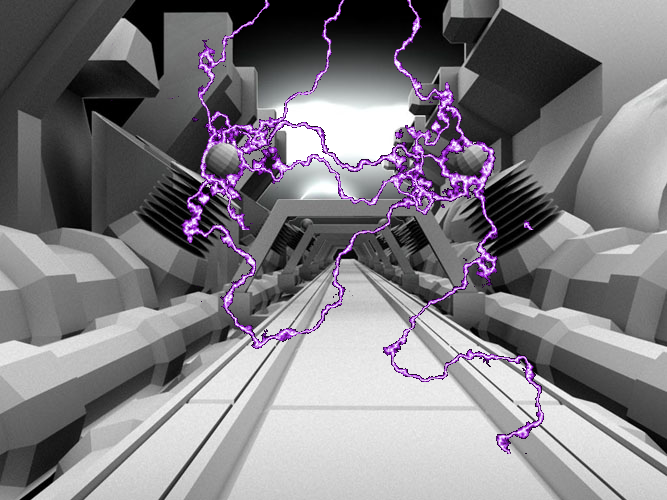
When I saw that hallway render (great job btw), I immediately thought of lightning. Don't ask me why. But I edited it a little....
Photoshop is fun. But I know not why it is so much darker. Maybe it is because I did not know what the heck I was doing.
Astro> gforce's smiles can cure cancer in kittensgforce422 is awesome because:
-He made the absolute nicest comments about me in the other topic. I didn't respond to them yet, because I suck, but they are greatly appreciated! =D
-I would say he would also be a good runner up as one of the nicest people alive.
-He joined the IRC sometimes. But not enough, I say! Chat moar =D
-He is evidently only 18 year old but he could easily pass for 25. =D
-He is a drummer like *I* am and this in itself is cool.
Astro> the happiness radiating from your person is enough to solve tensor calculus
<mib_4do271>everything you touch explodes in pillows of happiness
- GeorgiaCoyote
- Posts:1107
- Joined:Thu Dec 20, 2007 1:20 pm
- Location:Down South, USA
- Contact:
- VenM2
- Posts:1767
- Joined:Fri Nov 10, 2006 11:20 pm
- Location:Savannah College of Art and Design. Not really, I just go there for school.
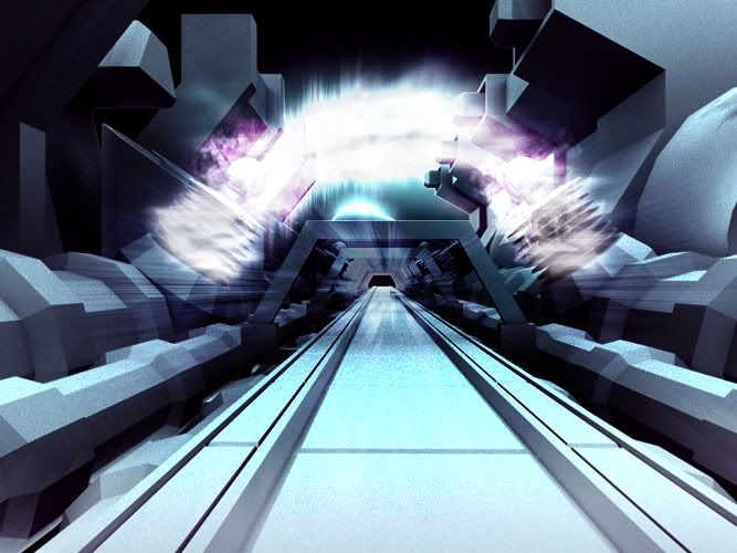
YOu see those bright lights in the background? THOSE are the electricity from those coils XD. I had 2 rendering layers. One with the master layer with all the objects (and yes, the electricity too) and a second layer to render all of the neat shadow effects and blended over the original as a multiply mask. What happend? The Electricity got covered XD!When I saw that hallway render (great job btw), I immediately thought of lightning. Don't ask me why. But I edited it a little....
You gave me inspirationWhen I saw that hallway render (great job btw), I immediately thought of lightning. Don't ask me why. But I edited it a little....
Photoshop is fun. But I know not why it is so much darker. Maybe it is because I did not know what the heck I was doing.
But I don't know what I'm doing either...
SweeeeeeeetYou gave me inspiration
But I don't know what I'm doing either...
Rich::
http://www.cocoa.uk.com/ - My blog
http://www.cocoa.uk.com/chat/ - Mac IM review site
http://www.cocoa.uk.com/chatterbox/ - My forums
http://www.cocoa.uk.com/gallery/ - Image galleries
http://www.cocoa.uk.com/seratis/ - Accessible psychiatry
http://www.cocoa.uk.com/chat/ - Mac IM review site
http://www.cocoa.uk.com/chatterbox/ - My forums
http://www.cocoa.uk.com/gallery/ - Image galleries
http://www.cocoa.uk.com/seratis/ - Accessible psychiatry
Who is online
Users browsing this forum: No registered users and 8 guests