Page 1 of 3
Everyone else was doing it, I just wanted to be popular
Posted: Thu Feb 22, 2007 7:31 pm
by Rooster
So here are some pictures I've sketched of my characters. Someone asked me on the IRC if I was selling shirts or planning to...and I hadn't really thought about it. But I've been playing around with ideas, and here are a couple for your delectations.
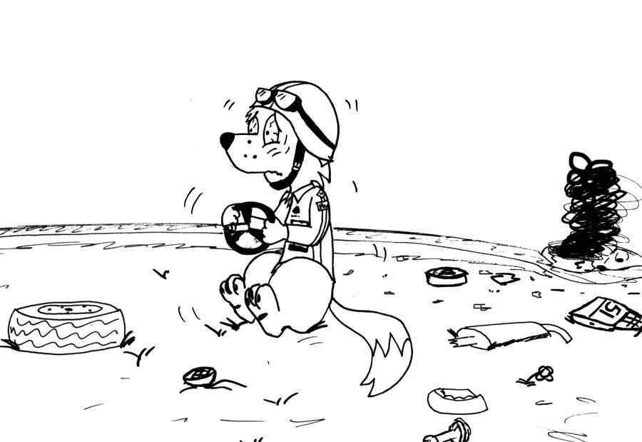
This first one, is titled "Jesse Was A Racecar Driver", and is sort of a homage to Primus...that and I wanted to practice my terror face.
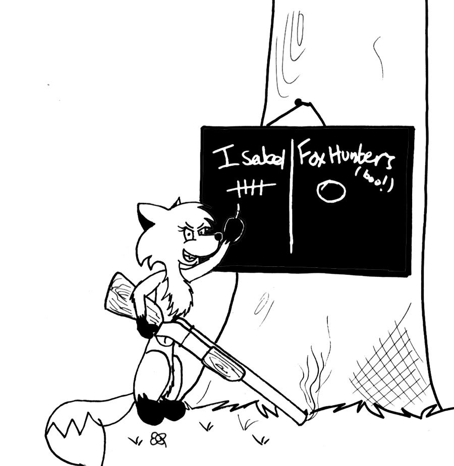
The next one is called "Isabel vs 500 Years of Tradition", and is pretty obvious where I got the idea from...if you know me and my opinions on said activity, you'll understand

There'll be some more in a few days, including the picture I promised Revan like three weeks ago ^^;
Posted: Thu Feb 22, 2007 7:42 pm
by Chris
The First one is good, The only thing ruined the drawing is that thingies on Jess' Eyes and The Second one is just plain creepy, The Chalk Board writing needs some fixing, The Word Isabel is hard to read and Her tail is somewhat funky looking. D=
Posted: Thu Feb 22, 2007 7:44 pm
by FerretParade
You have now achieved popularity
Posted: Thu Feb 22, 2007 8:05 pm
by Llewthepoet
Jess's Trauma Versus Isabel's Anger! THEY BOTH WIN!
Posted: Thu Feb 22, 2007 8:35 pm
by Foxhound
Hmmm...Isabel's the one who carries around guns, eh? Definitely win and awesome for both.
Posted: Thu Feb 22, 2007 8:52 pm
by Tom Flapwell
You have now achieved popularity
What, just now?
Chris, I agree that Jess's eyes, while accurate, are a little hard to look at -- they make me want to rub my own eyes. The handwriting, however, is appropriate for Isabel, and I'm satisfied with her tail.
Posted: Thu Feb 22, 2007 9:29 pm
by Bocaj Claw
Roo, I'd be likely to buy the second one. And wear it constantly to the befuddlement of my friends.
Posted: Fri Feb 23, 2007 2:08 am
by Zaaphod
Those are good, me likey!

Posted: Fri Feb 23, 2007 2:13 am
by Tabris_The_17th
They are both really quite nice. I think I'd be more likely to wear the second one as well though.
Posted: Fri Feb 23, 2007 3:36 am
by Comrade K
For sure the second one.
But it would need some cleaning up.
Isabel seems a bit stretched out.
Posted: Fri Feb 23, 2007 4:02 pm
by Priest_Revan
The first one is kinda cute, but I'm into the second one more.
Posted: Fri Feb 23, 2007 5:12 pm
by Muninn
The First one is good, The only thing ruined the drawing is that thingies on Jess' Eyes and The Second one is just plain creepy, The Chalk Board writing needs some fixing, The Word Isabel is hard to read and Her tail is somewhat funky looking. D=
Um, Chris, he DID say they were sketches. Sketches don't have to be clean.
I think the second is marginally better than the first.
Posted: Fri Feb 23, 2007 5:41 pm
by Rooster
Cheers for the input so far dudes.
Yes, these are just preliminary sketches that took about half an hour each to sketch and ink. They'll be a lot cleaner and have more details like colour and captions if or when I make them for real.
I've got some more coming soon, including a Reuben one.
Any ideas for shirts would be cool, as my brain doesn't work in one-liners...it prefers scripts.
Posted: Fri Feb 23, 2007 6:14 pm
by Kyler Thatch
Hm... I had a feeling the second one would be a crowd favorite. It might work as a shirt, if you fix it up a little. You know, general cleanup, making sure the text is fairly readable. The usual stuff.
Now that you mention it, though, I'd like to see what other sketches you've come up with.
Posted: Fri Feb 23, 2007 10:07 pm
by Comrade K
The second one is fairly self-explanatory, I don't think it needs captions...