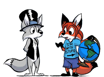
Yay, it's almost complete!
Moderator:Æron
-
Priest_Revan

- Posts:766
- Joined:Tue Nov 07, 2006 11:23 pm
- Location:Mother
- Contact:
If you put peanutbutter anywhere on your body, I'll lick it off...
ANYWHERE.
 My deviantart... though it does suck.
My FA... nothing's on it right now, so there's no point to click it.
ANYWHERE.
My FA... nothing's on it right now, so there's no point to click it.
-
Baconsticks
- Posts:2055
- Joined:Fri Jan 18, 2008 10:57 pm
- Location:Two Days To Last Thursday

-
Southern Gentleman
- Posts:29
- Joined:Sun Mar 09, 2008 4:51 pm
- Location:Georgia
- Contact:

This is looking good Revan! I can't wait for it to be finished.
[00:34:00] <Dermy> I do love to manipulate the standard rules of language for opportunistic effect
[00:34:06] <Dermy> Like a grammar hyena, I am
[00:34:16] <Dermy> Munching on the tasty entrails of tradition
[22:26:20] <MuffinSticks> I'm a chocolate muffin with white ears and a striped black and red tail
[22:26:35] <MuffinSticks> And exactly 6 chips
My DA account, for those who care enough to look/click/etc.
And my FA account as well!

-
VolkswagenFox

- Posts:472
- Joined:Sun Feb 18, 2007 10:36 pm
- Location:Barrie, Ontario
- Contact:
-
Tabris_The_17th

- Posts:2276
- Joined:Sat May 06, 2006 5:31 am
- Location:Crestfallen
- Contact:
See, this is the kind of thing I need to take the time to do. I'm holding off until I have all my characters introduced at least.
I think this is looking really nice! The character's image are great. I especially like how no two characters are positioned the same way and they're all showing slightly different facial expressions. Not every character page will take the time to do that. I'm not sure about how you've aligned the images with the text boxes though. Seems kind of awkward having them below the image AND off to the right. What about having the images and text box centered with one below the other? Or having the images stay where they are but move the text boxes up to aligned with the center of each image? Just thoughts. I'm no web designer after all (I made my friend do it with AIAC, HA!)
I appologize, but I have to put my English degree to go use now (I so rarely get to anymore). In Andy's bio, you left out a period after "even if he doesn't realize." Also, I think the sentence before that could be worded a little better. Maybe something like: "He's the constant source of Travis' trouble."
Just one other thing: Leah profile seems to paint her as kind of mean. Granted what you say is true about her, but there's a definite friendliness you often depict in her that isn't addressed.
Anyway, hope that helps some ^-^ It really does look spiffy.

www.aiacrowd.com- Now updating every Tuesday and Friday!
"Like a post modern Peanuts with cat eared girls...kinda"


-
Priest_Revan
- Posts:766
- Joined:Tue Nov 07, 2006 11:23 pm
- Location:Mother
- Contact:
Yeah, I saw the grammatical errors, but I'm too lazy to fix them right now...See, this is the kind of thing I need to take the time to do. I'm holding off until I have all my characters introduced at least.
I think this is looking really nice! The character's image are great. I especially like how no two characters are positioned the same way and they're all showing slightly different facial expressions. Not every character page will take the time to do that. I'm not sure about how you've aligned the images with the text boxes though. Seems kind of awkward having them below the image AND off to the right. What about having the images and text box centered with one below the other? Or having the images stay where they are but move the text boxes up to aligned with the center of each image? Just thoughts. I'm no web designer after all (I made my friend do it with AIAC, HA!)
I appologize, but I have to put my English degree to go use now (I so rarely get to anymore). In Andy's bio, you left out a period after "even if he doesn't realize." Also, I think the sentence before that could be worded a little better. Maybe something like: "He's the constant source of Travis' trouble."
Just one other thing: Leah profile seems to paint her as kind of mean. Granted what you say is true about her, but there's a definite friendliness you often depict in her that isn't addressed.
Anyway, hope that helps some ^-^ It really does look spiffy.
If you put peanutbutter anywhere on your body, I'll lick it off...
ANYWHERE.
My deviantart... though it does suck.
My FA... nothing's on it right now, so there's no point to click it.
ANYWHERE.
My FA... nothing's on it right now, so there's no point to click it.
-
GeorgiaCoyote

- Posts:1107
- Joined:Thu Dec 20, 2007 1:20 pm
- Location:Down South, USA
- Contact:
Nice character page, the bios are very descriptive without giving away the entire plot of the strip. The portraits are cool too :-)
Just a little web-nerd tip, you might want to make the backgrounds of the descriptions a solid colour, they're a little hard to read over the bold background image. Not saying it's a bad background image, just that text directly over it is a bit difficult to see due to the visual "strength" of the background image.
I'm not sure how much HTML you know, but it's easy to do without dramatically changing the layout or adding a ton of code.
Who is online
Users browsing this forum: No registered users and 30 guests